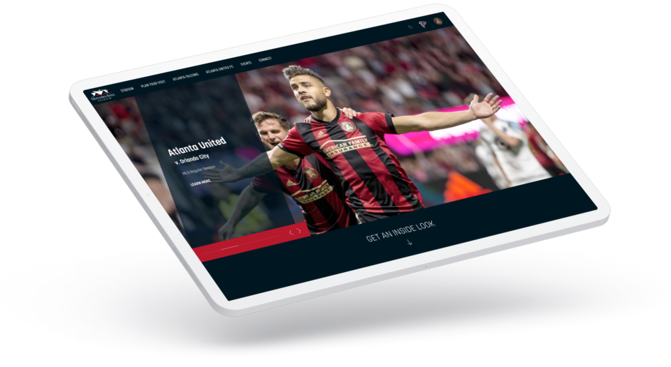
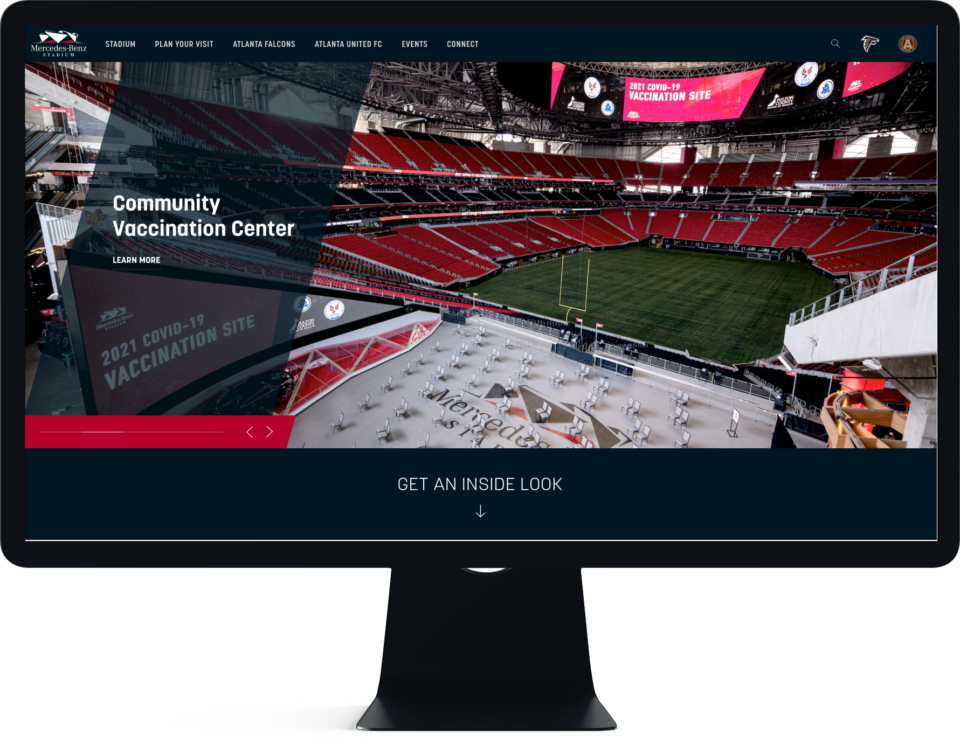
Mercedes-Benz Stadium
-
Honoree: Best User Experience
Honoree: Best Home/Welcome Page
Nominee: Best Sports Website 2018 -
Project Type
Full Site Redesign & Build
-
Client
Arthur M. Blank Sports & Entertainment
-
Years
2017 — 2019
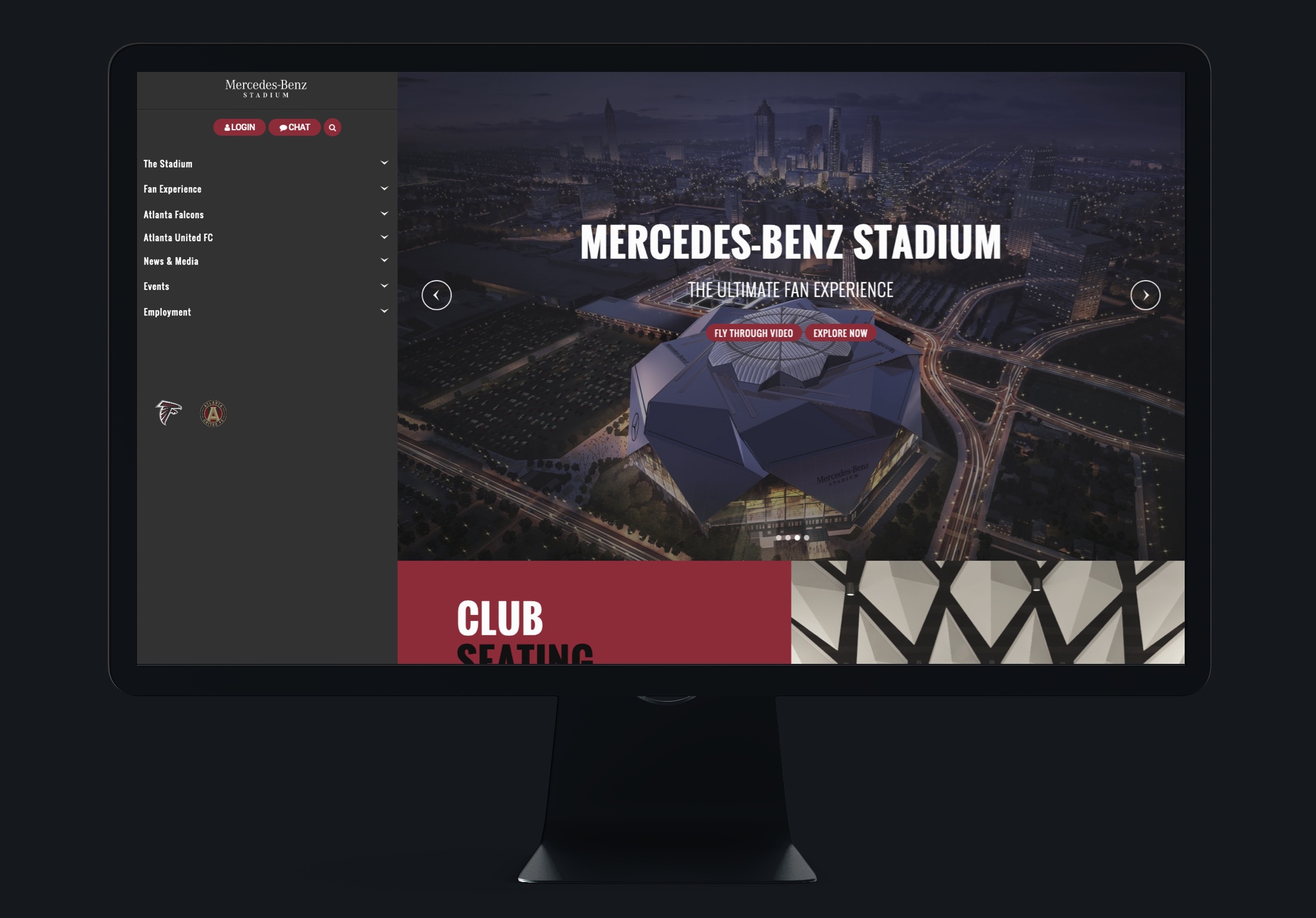
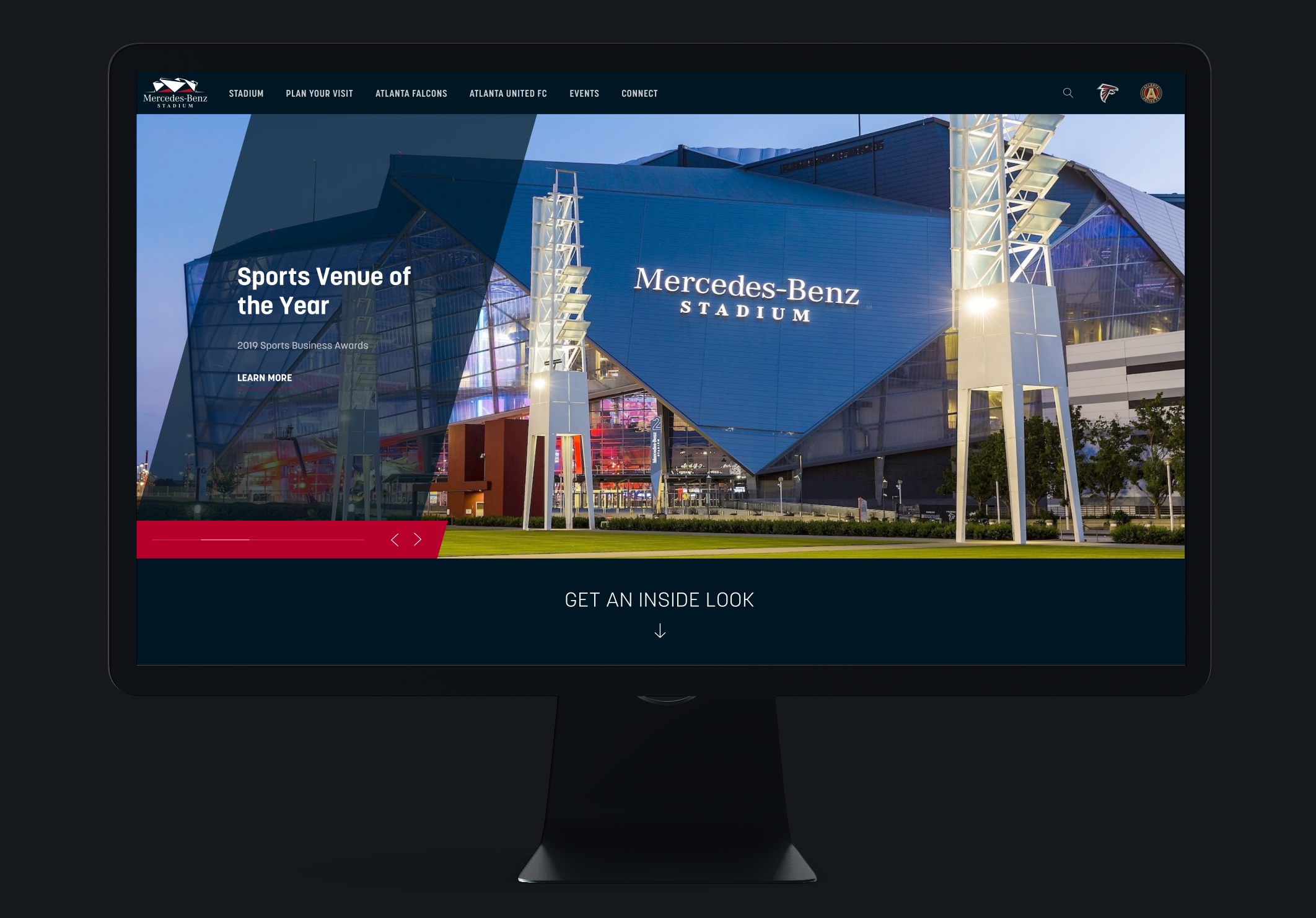
Before & After
Before
After
The Case
In 2017, I got the call from a representative of Arthur M. Blank Sports & Entertainment. Their predicament was a standard one: the big-name firm that was looking after their site was doing what big-name firms do and didn’t seem able to get it quite right in the little time that was left. Big moments were approaching both for the stadium and the company, and the site simply wasn’t up to par.
My Roles
- planning & strategy
- project management
- all user interface design
- all user experience design
- all initial programming
- feature design & conception
Discovery
After two initial meetings we identified the project goals and priorities. The client’s main needs were streamlining the information architecture and modernizing the look and feel of the product.
The Project Plan
Once the two overarching goals were established, I drew up a list of recommendations containing the steps and actions required from a tech and design standpoint. I split them into logical sequences on two tiers: a macro-sequence containing the main steps, with each step containing a micro-sequence of required actions to be completed.
The Site Plan
400 Pages, 16 Layout Types
I drew up a Scope of Work spreadsheet containing the site structure, and the precise details of each of the required page types.
These were each assigned layout types. The final tally was little over 400 pages, split into 16 layout types.
Execution
The Design Phase
Once the Site Plan was approved by the client, it was time to move on to designing the required initial prototypes.
Pivotal Moment
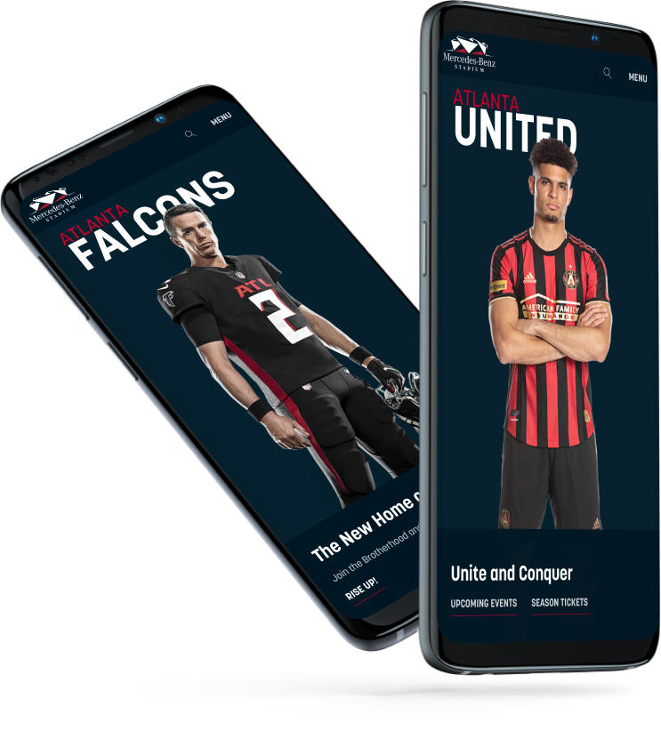
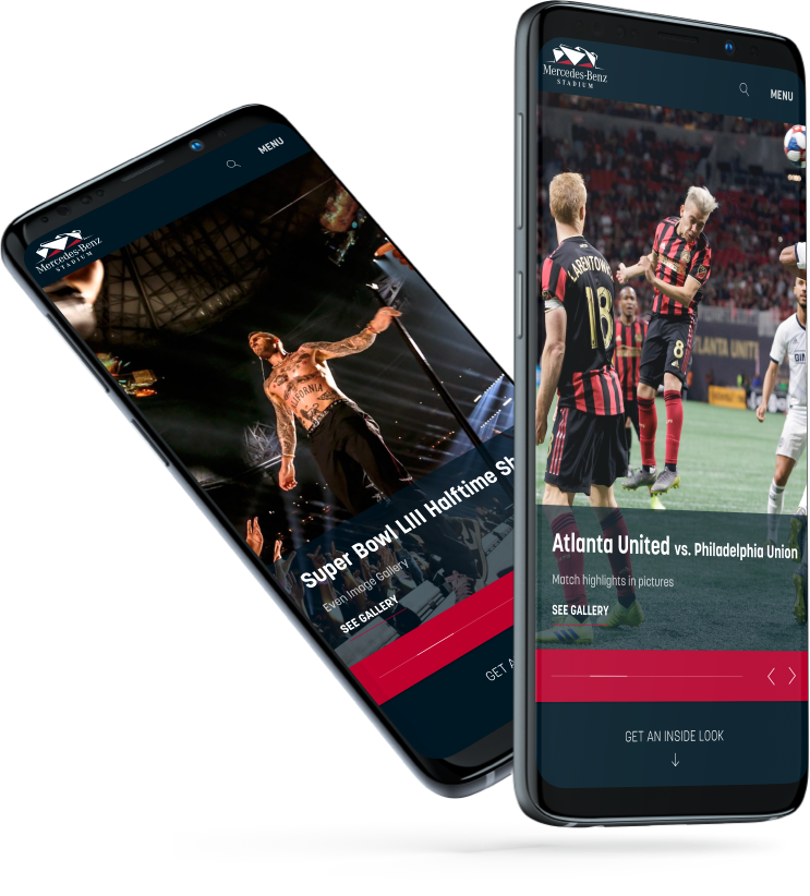
The original intent was to slightly evolve the existing design. However, I had realized by this stage that the inconsistencies in the old concept were simply too deep and too many to fix.
It became clear to me that he most efficient method was to abandon the old product completely and start with a fresh, clean concept. However, this required approval from several stakeholders at all levels. If we were going to completely replace a product that took years to build, it should be worth it. In other words, whatever new designs I was going to propose, they’d better be good.
I expected the design approval process to last. I was wrong. Same-day approval from everyone involved, no revisions. “It’s perfect. Build it!”
The Modesty Panel
The Programming Phase
I created a new blank WordPress theme and got to work. The 16 layout types and their component modules took four weeks to build and combine.
Client Training
The modernized Content Management System was quite a departure from that of the old product, but it was mostly self-documenting and self-explanatory. Therefore training was smooth and adoption was instant.
Launch
Review and approval were swift, as most of the new elements had been approved in the design phase.
We went live eight weeks from the initial proposal.
